The Dos and Don’ts of Logo Colors
When we first started out as a company, we did a lot of logo designs for small- to medium-size businesses. We love finding the right mix of visual elements, text, and fonts to represent a brand’s personality . We also know a thing or two about the dos and don’ts of logo colors, and we’ve jotted them down for you:
 Color Quantity
How many colors should you use? Glad you asked! There are plenty of big brands like Google and eBay that use more than three colors in their logo! Other brands like Apple and Nike keep it simple. The amount of colors you decide to use in your logo is completely up to you and your brand’s personality, but one thing to keep in mind is the printing cost. When you create and print marketing materials like business cards, stationery, folders, post-its, etc., the more colors to send to the printers, the higher the cost.
Gradients add an extra consideration if you choose to adopt a multi-colored logo. There is a bit of controversy among designers as to whether or not to use gradients, but there are some amazing logos that do use them, like Airbnb, who chose to use gradients of blue. While it is visually pleasing and represents their brand personality, it’s probably pretty expensive to print as well. If cost isn’t an issue and you love gradients, this list of logos using gradients will help you navigate whether they can be effective for your brand or not.
Complementary Colors
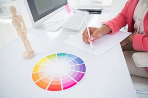
If you are going to use two or more colors, use contrasting and complementary colors. What are those, you ask? Allow us to take you back to your elementary school art class. If you look at a color wheel like the one in the photo above, you’ll see the primary colors of red, yellow and blue and all those secondary and tertiary colors in between.
Complementary colors are across from each other on the color wheel. For example, blue and orange are complementary colors. By using the contrast of these colors, the elements of your design will stand out more. Many sports teams use this technique as well: blue and gold, blue and orange, yellow and purple.
Be careful not to use a 50/50 ratio, however. If the colors are quite strongly contrasted, equal proportions may overstimulate a viewers’ perception. Instead, choose to use around 70% of one color and 30% of the other, so that there is a clear focus and the two colors don’t cancel each other out.
Take a look at this logo design as an example:

We used complementary shades of yellow and purple, on the opposite end of the color wheel, but we didn’t give them equal screen time. The yellow and white make a solid base for the purple lettering to pop even more.
Color Blindness
Remember that you are creating this logo not only to represent your product but also for potential customers to see. According to the Colour Blind Awareness Foundation, one in every eight males and one in every 200 females have some degree of color blindness.
In fact, did you know that Mark Zuckerberg has red-green color blindness? He can’t differentiate between the two, so he chose blue as the color of the Facebook logo because he can see all the shades of blue without a problem.
To combat issues of color blindness in potential customers, remember to use high contrast when using complementary colors, and don’t rely on color as the sole conveyor of information. Rather, keep a healthy mix of visual and text elements to get your information across.
Want some more examples to stimulate your logo brainstorming? Check out our logo portfolio page or our facebook logo gallery.
