3 Examples of Successful Inbound Marketing Websites

When building your website did you consider the marketing strategy behind the design? If your marketing and sales goals include generating new leads, it might be time to understand the success of a website built with inbound marketing in mind.
The best practices to follow when building a successful inbound website come down to a few basic principles. When you look at a successful website, you should see elements that educate, nurture, and capture prospects or sales leads.
What Do Great Inbound Websites Need?
Not everyone is going to agree on what makes a website successful, or what makes one a good example of Inbound marketing. In Uncle Jake Media’s experience, there are a few foundational principles that help make a website a successful inbound marketing tool.
1. It must have a visually appealing website design.
The appeal of a website’s design and layout can be very subjective. You may look at a website and think it looks outdated, while your co-worker could look at the same website and love it. The main thing to do before designing your website is to have your team on the same page about the look and feel - a good place to start is to make sure everyone has visited your current website.
The goal of the website is to resonate with your ideal buyer because it is ultimately their opinion that matters. Make sure you understand your buyer personas so you can design with them in mind. Start with imagery that your ideal buyers can relate to. If they can see themselves on your site, they will connect more with your message.
2. The website content is helpful and educational.
Put yourself in the shoes of your buyer - what questions would you ask that would lead you to your website or make a purchase from your company? Any questions that your sales team has to answer often are the questions you should be answering on your website. The more you can share upfront to solve your prospect’s problem or question, the more trust you get from them.
The types of content you put on your site can position your company as an educator and thought leader. Think about utilizing one of the content types below:
If the written content isn’t something your ideal buyers resonate with, consider using video to educate your website users. With video becoming the top media consumed on websites, perhaps turn your most recent blog post or FAQ section into multiple videos.
3. Your user can easily navigate the website.
If a user can’t easily navigate your site within the first 5 seconds to find information that is relevant to them, then it is time to make some updates. If you aren’t sure if your ideal buyers can find the info they need quickly, ask your current customers for feedback on your website’s navigation - after all, your customers probably represent your target audience better than anyone!
A good rule of thumb is to make sure users can navigate to what they need in no more than three clicks from the homepage. Anything more than that causes some serious frustration and we recommend you avoid causing a broken laptop as much as possible.
%20-%20Examples%20of%20Great%20Inbound%20Marketing%20Websites.gif?width=337&height=220&name=%5BUJM%5D%20Blog%20(Draft)%20-%20Examples%20of%20Great%20Inbound%20Marketing%20Websites.gif)
Use clear navigation on your website - Your prospect's laptop will thank you.
5. You must inspire your users to take action.
One of the most important things to consider when designing your website is if you have optimized for conversion. If you aren’t driving your users to contact sales then your website isn’t an effective marketing tool.
Simply put, a conversion is getting someone to respond to your Call-to-Action (CTA) on your website. A CTA can be a button, a link, or even an image that encourages your visitor to make an action. Usually, this action is to click in order to download a content offer or fill out a form. If you want to learn more about building a website that drives a user to take action, read our article titled How To Design Your Website As An Effective Marketing Tool.
Now, that you know what a great inbound website has it is time to look at who has done it right. Let’s take a look at 3 industry-leading websites for inspiration.
1. Asana
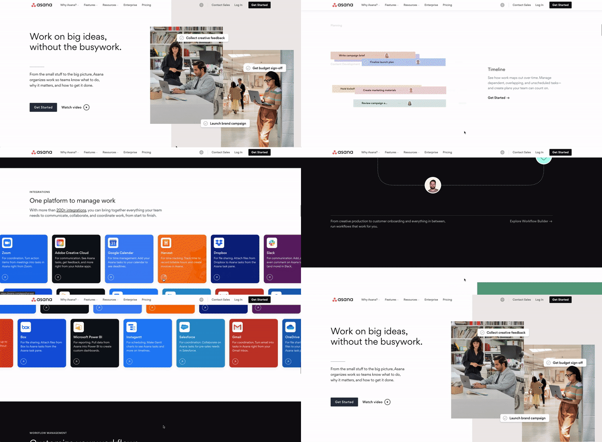
Asana is a customizable workplace content management system (CMS) and is designed to help companies with project management and organization. The software is designed to help many types of teams or companies get things done efficiently and their website showcases that effectively.
Customer Focused Navigation
The product education section of Asana’s website is nicely organized by purpose or industry of the end-user, which makes it easy to find the right content very fast.
Clean & Simple Design
The homepage is simple with a lot of white space, which draws the user to the page content and drives them to choose their user journey on the website and click through to more pages. Asana provides a customized experience by talking directly to the buyer rather than in general terms.
Product-Focused Resources
One thing that really sticks out is the Asana Academy, which provides the user access to webinars and helpful videos. This is a great way of showcasing their product and how it helps customers see great results. Video is being used in a great way to build trust by educating through use-case examples and showcasing product features in an easily digestible format.
2. Warby-Parker
Many Saas (Software-as-a-service) companies, like Asana, are leading the industry with inbound marketing tactics. But Product-based companies can be just as successful utilizing an inbound strategy, especially in their website design. So for our next example, let’s look at Warby Parker, a well-known glasses retailer.
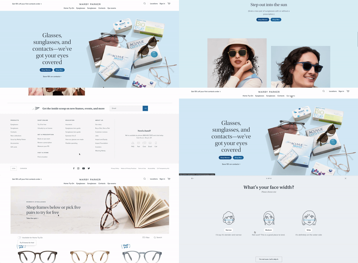
Even if you don’t wear glasses, Warby Parker has an interesting and personalized approach to their inbound marketing and they prove that on their website. The website captures the user's attention and gets them to take action with interactive content offers.
An Interactive Quiz
Warby Parker created an interactive quiz that users can take to receive recommendations on eyeglasses they might want to try on at home, encouraging the free trial registration. This creates a fun, low-friction way to get visitors to convert and opt-in to their marketing emails.
Store Location Finder
If your business has brick-and-mortar store locations, it is important to include a call-to-action for users to find a location near them. This tool can also be customized to capture demographic information that could allow you to utilize geographic ad targeting or email marketing.
3. HubSpot
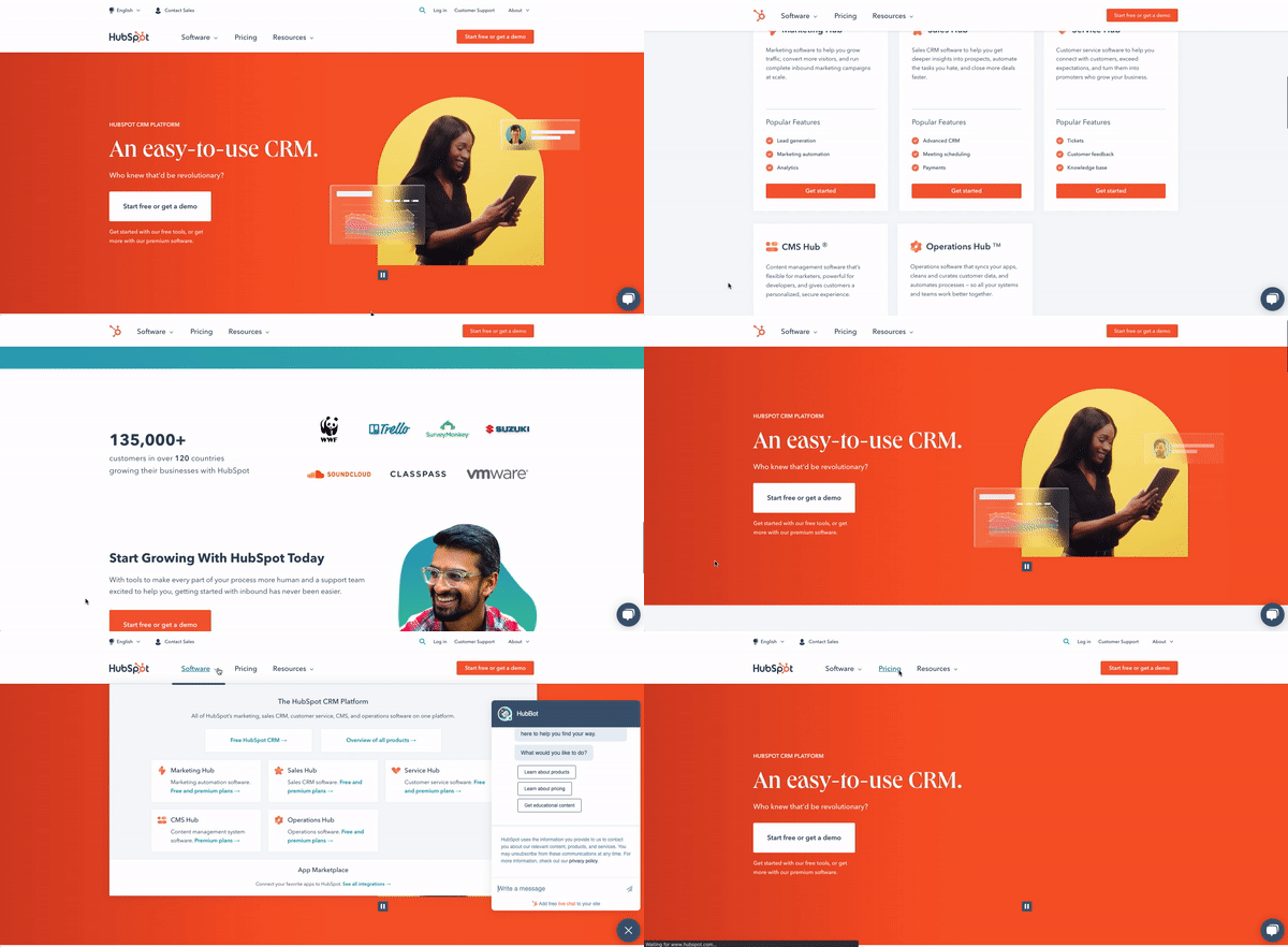
If you know of HubSpot then you might be thinking, “Well, DUH, of course, HubSpot is going to be on this list - they basically are a founding father of Inbound,” and that is exactly right. HubSpot is an industry leader in Inbound Marketing education and software, which is a great reason to look to them for inspiration and best practices.
A Space for Customers and Prospects to Communicate
A lot of big companies struggle to be educational and just focus on revenue, but HubSpot is not one of those companies. Their website and digital presence have remained a helpful and educational resource throughout their rise as an industry leader by using tools like a community forum.
Even if you don’t have the ability to build a custom community forum, utilize tools like Facebook Groups or other social platforms to drive community engagement and trust then showcase it on your website.
Showcase Clear Pricing
Not all companies have a product or service where transparent pricing is possible. Custom services can make it extremely difficult to do so, but if you do have the ability to share base prices then it is a great idea to have that on your website.
HubSpot’s transparent pricing information on the website provides the user with as much information as possible. Not only does this build trust, but it drives the user to contact sales and get started. By providing this information to the user, HubSpot is enabling their sales team by shortening the sales process once the user contacts them.
With inspiring testimonials, and a knowledge center that has more information than a public library, HubSpot is truly an educational resource for not only buying a CRM but for running a successful business or marketing team.
What’s Next?
Now that we have looked at some fantastic inbound websites, you might be asking “what is next?”
The UJM team would recommend you and your team to go through your website and grade yourselves on the inbound performance of your site. If you need a place to start reviewing your website performance, use our free website grader tool.
After you have done that, put a plan together of how to increase the score of each category.
If it all seems a bit daunting, no worries! We have a fantastic team here at UJM who would be more than happy to help!


%20-%20Examples%20of%20Great%20Inbound%20Marketing%20Websites-2.png?width=624&height=320&name=%5BUJM%5D%20Blog%20(Draft)%20-%20Examples%20of%20Great%20Inbound%20Marketing%20Websites-2.png)
%20-%20Examples%20of%20Great%20Inbound%20Marketing%20Websites-Apr-26-2022-05-30-16-96-PM.png?width=624&name=%5BUJM%5D%20Blog%20(Draft)%20-%20Examples%20of%20Great%20Inbound%20Marketing%20Websites-Apr-26-2022-05-30-16-96-PM.png)

%20-%20Examples%20of%20Great%20Inbound%20Marketing%20Websites-3.png?width=624&name=%5BUJM%5D%20Blog%20(Draft)%20-%20Examples%20of%20Great%20Inbound%20Marketing%20Websites-3.png)
%20-%20Examples%20of%20Great%20Inbound%20Marketing%20Websites-1.png?width=624&name=%5BUJM%5D%20Blog%20(Draft)%20-%20Examples%20of%20Great%20Inbound%20Marketing%20Websites-1.png)

%20-%20Examples%20of%20Great%20Inbound%20Marketing%20Websites-4.png?width=624&name=%5BUJM%5D%20Blog%20(Draft)%20-%20Examples%20of%20Great%20Inbound%20Marketing%20Websites-4.png)
%20-%20Examples%20of%20Great%20Inbound%20Marketing%20Websites.png?width=624&height=480&name=%5BUJM%5D%20Blog%20(Draft)%20-%20Examples%20of%20Great%20Inbound%20Marketing%20Websites.png)
